Over the years, Bio Nebraska has grown and evolved into the association it is today, representing more than 80 companies and organizations across the state’s bio-ecosystem.
Bio Nebraska members have helped shape the association into what it is today and where it is going. In January, the beginning of its 15th year as an association, the Bio Nebraska Board of Directors determined it was time to update the association’s image to align with and more closely represent Nebraska’s bio-ecosystem.
After extensive research and careful consideration, the Board of Directors agreed on a new logo, a new Bio Nebraska identity, that sets Bio Nebraska apart, but yet still pays homage to its history and members.
About Our Logo
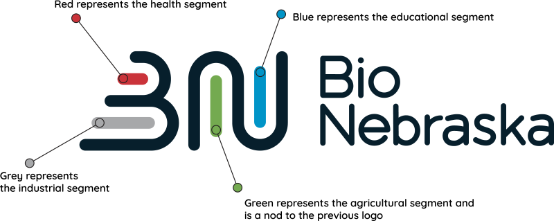
The logo is more than just an image, it represents the association and its members. The original Bio Nebraska logo used green and black as the main colors. The new logo is multi-colored with a specific color representing key segments of the bio-ecosystem: Health (red), Grey (Industry), Green (Agricultural), and Blue (Education), which more accurately represents Bio Nebraska’s members.

- The horizontal and vertical parallel lines create the “B” and “N” of the new Bio Nebraska logo represent a number of aspects of Bio Nebraska.
- The parallel lines symbolize how the organization and members work toward common goals.
- The horizontal lines echo the reach of Bio Nebraska from the Missouri river to the western-most border.
- The vertical lines represent the depth of our combined knowledge and experience.
- The angular edge of the “B” suggests forward movement—looking to the future of the bioscience industry.
